logos
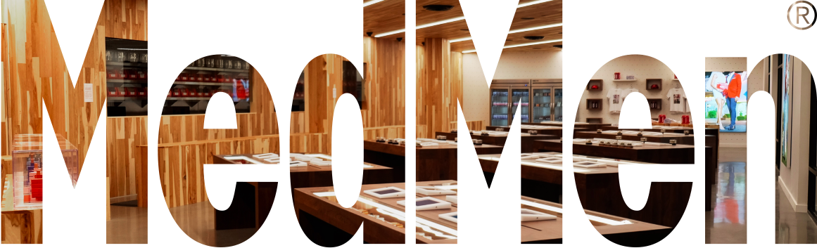
MedMen is always a single word with an uppercase 'M'. Name is never split into two words and any space.
Primary Logo
Logo with Store Name
White logo w/Red Background
White logo w/Black Background
App Icons
colors
The MedMen corporate palette consists of three colors: MedMen red, black, and white. MedMen red is the core of our brand identity and should appear whenever possible for members to immediately identify our brand.
Main Colors
Primary Red
#960709
Primary Black
#222222
Primary White
#FFFFFF
Accent Colors
Dark Red
#550505
Pink
#FF9F00
Orange
#FF9F00
Dark Gray
#7C7C7C
Medium Gray
#AAAAAA
Medium Light Gray
#DDDDDD
Light Gray
#F4F4F4
Product Colors
High CBD
#00563F
Hybrid
#873299
Indica
#000A8B
Indica Dominent
#00A8E1
Sativa
#FFB819
Sativa Dominent
#EA1D76
typography
We use Avenir Next Family (Regular,Demin Bold, Bold) for iOS device, giving text in MedMen a fun and friendly feel to match our brands.
Avenir Next
icongraphy
Our iconography style aligns with our personality and echoes the foundational elements of our brands. Our product and UI icons are characterized by simple, flat art with a thin line style that aligns with our logos and fonts.
Icons on Color Background

Icons on White Background

buttons
Button sizes and behavior remain consistent across all platforms and screen sizes.

Primary Button


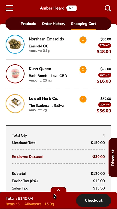
Checkout Button
Secondary Button
Circle Button
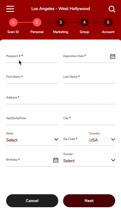
input
Whether it's a web form, a challenge in a Lesson or speech functionality, our input fields are designed to minimize friction between the learner and the action.
Primary Input
Sign-in Input
Checkout Input
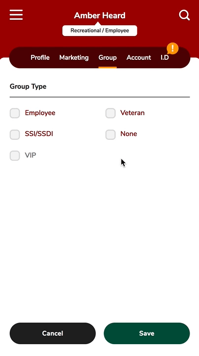
Checkbox
navigation
There 4 types of navigation sucah as Hamburger Menu, Primary, Process, and Tab Navigation. We are using these each pages depending on contents.
Hamburger Mobile
Hamburger Desktop
Primary Navigation

Process Navigation

Tab Navigation