LuxLyte

UI/UX Design
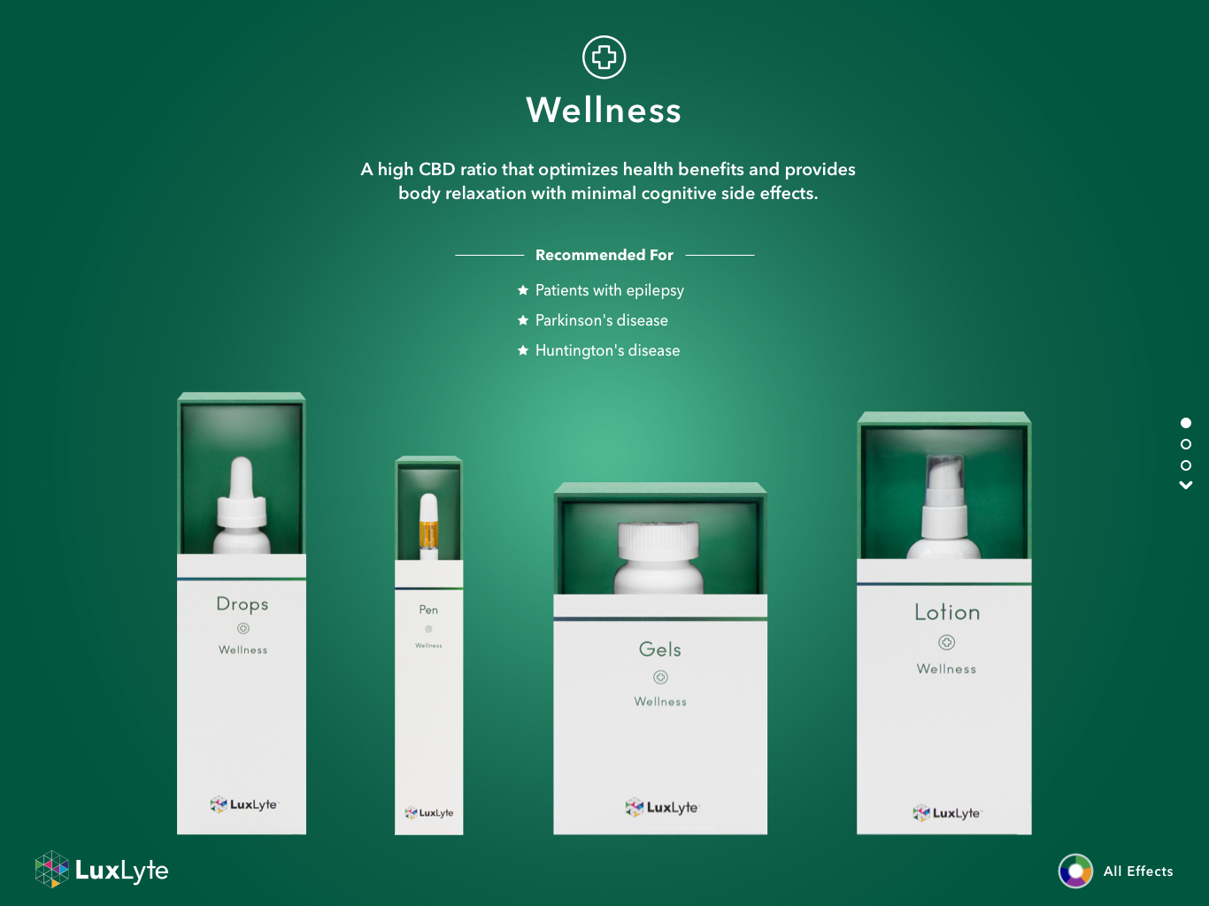
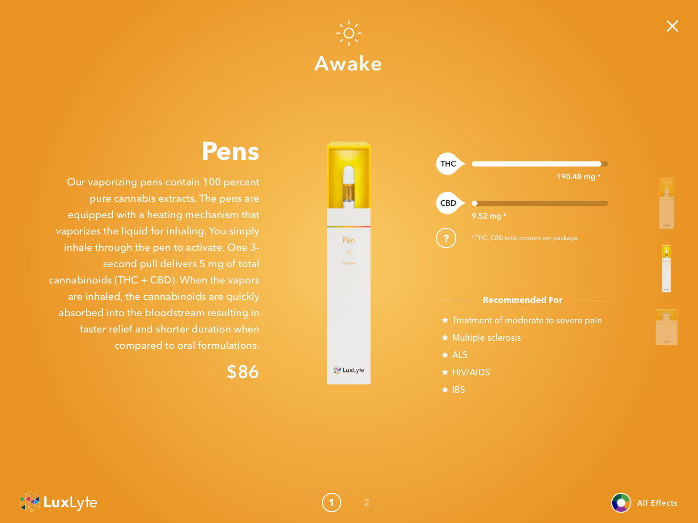
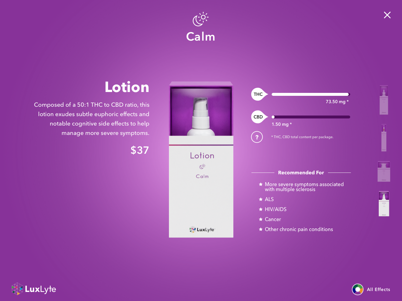
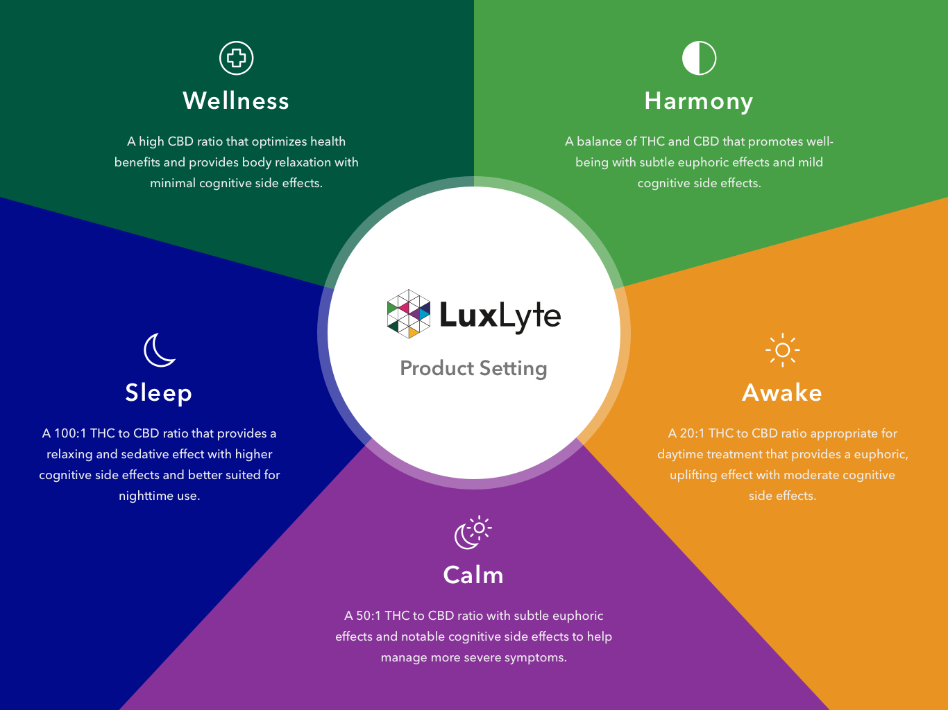
LuxLyte is a premiere cannabis product line created by MedMen. This product line is available at the store only in New York. LuxLyte iPad is presenting on the table for each product lines by effect such as Wellness, Harmony, Awake, Calm, and Sleep. Customers can order from screens, which give detailed information about what each product contains.

Problems

LuxLyte iPad is a digital curiator for MedMen store customers. It's not easy to distinguish each effects on iPad becuase products are displaying on the white background and product case colors are only way to recognize the effects. Additionally, UX is not good for iPad, so customer are suffering from using it to get more detail inforamtion. Conclusionally, customer ask to store staff individually and iPad lose the original purpose.

Solution

Reorganize products by effects and emphasize each effect colors on background to recognize esily. Also, add the effect descriptions on the main page customer can understand about the product what should be good for them at once. Morover, product lineup is a new navigation to go to detail page.
Highlighted Works